
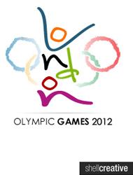
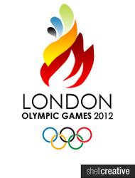

With the Olympic logo debate still raging on, our readers have come up with some alternatives to the controversial design.
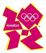
The logo, designed by ad agency Wolff Olins, was unveiled last Monday.
The jagged emblem, based on the date 2012, took a year's work and £400,000 investment.
It has already divided public opinion and within 12 hours of its unveiling, an online petition to get it dropped attracted more than 13,000 signatures.
A section of animated footage promoting the games also had to be pulled from the organisers' website after fears it could trigger epileptic fits.
Organiser London 2012 is re-editing the film after charity Epilepsy Action received calls from people who suffered seizures after seeing it.
MPs have signed a series of Commons motions calling for a rethink on the logo.
Conservative MP Philip Davies dubbed the design "childish and ridiculous" and "a pathetic attempt to appear trendy".
Do you like these designs? Use the comment feature below to tell us what you think.


Comments: Our rules
We want our comments to be a lively and valuable part of our community - a place where readers can debate and engage with the most important local issues. The ability to comment on our stories is a privilege, not a right, however, and that privilege may be withdrawn if it is abused or misused.
Please report any comments that break our rules.
Read the rules hereComments are closed on this article